

Text fields are the bread and butter of front-end development. Yet I always have to check its API to find methods that I’m looking for. In this article, I’ll cover one part of it - borders. This is probably the first element that creative product designers will change, and you must implement it.
How to display Material TextField
By design, when TextField is used, it follows Material Design specification Text fields – Material Design 3. Below, you can see how it looks with the useMaterial3 switch on. 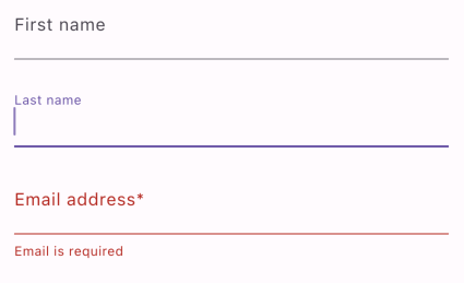
In code, it looks like this (first field only):
1
2
3
4
5
TextField(
  decoration: InputDecoration(
    labelText: 'First name',
  ),
)
TextField widget handles all that heavy work related to animating labels and changing colors for you. But already, in this example, you can spot a crucial element - InputDecoration.
How to add a border to the TextField
If you read the previous paragraph, you expect what will happen - InputDecoration is where you can control the border. There is a border property that expects an object that implements InputBorder. By default, UnderlineInputBorder is used, but to get a closed border, you should provide OutlineInputBorder.
1
2
3
4
5
6
TextField(
  decoration: InputDecoration(
    labelText: 'First name',
    border: OutlineInputBorder(),
  ),
)
And again, the heavy lifting was done by the Flutter team. Label moves out of the scope and lands on the border for free — the same with the color of focused or fields with error.
If the default behavior doesn’t fit the style of your application, you can go wild with *Border named fields like errorBorder, focusedBorder, and disabledBorder.
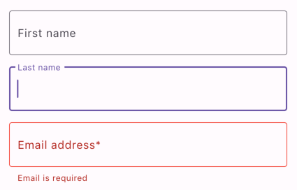
OutlineInputBorder is not just an empty class. You can configure different aspects of the border display.
1
2
3
4
5
6
7
8
9
10
OutlineInputBorder(
  borderSide: BorderSide(
    width: 2,
    color: Colors.amber,
  ),
  borderRadius: BorderRadius.only(
    topLeft: Radius.circular(8),
    bottomRight: Radius.circular(8),
  ),
)
Of course, InputDecoration offers more - background color, suffix, and prefix widget/icon, hint text, and text styling, to name a few.
Summary
TextField has an extensive API that allows customization. Setting border over field is a common task, so the Flutter team prepared OutlineInputBorder for us, which makes that task easy.
Complexity: Basic
Used Flutter version: 3.7.3